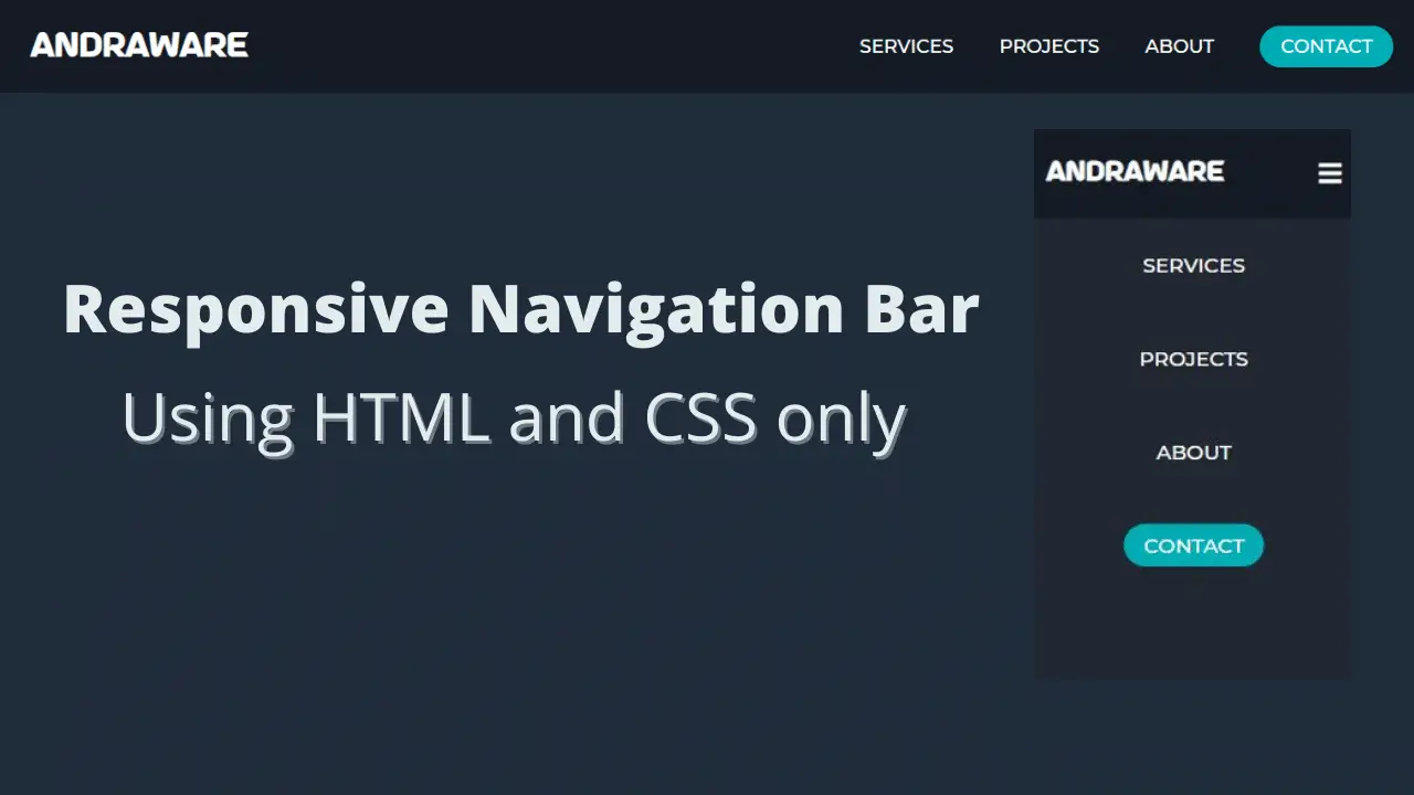
Navbar is one of the main aspects that throw a good impression on the visitors. One needs to have a simple, well-managed navigation bar.
Last time, I had shown you to make a simple navigation bar using flexbox in HTML5 and CSS3. But that has a problem as it was not responsive. Nowadays, a responsive design is the most. You need to design a responsive design so that users can see all the menus available.

Through this blog, you will know about how I created this simple navigation bar using only HTML and CSS only. You don’t need to know javascript to accomplish this. One of the best parts of this blog is it is responsive. It is fully responsive for all devices including mobile and tablet too. For certain devices, it will show a hamburger icon, and when you click the hamburger icon, it will show the list of dropdown menus.
Video tutorials of Responsive Navbar using HTML and CSS only
NavBar Source Code
First, copy the HTML codes and create a file named index.html and paste the Html codes and save it. Remember file extension must be.html.
Second, copy the CSS codes and create a folder named styles. It’s good to arrange all the files in a good way. Then create a file named styles.css and paste the CSS codes.
<!DOCTYPE html>
<html lang="en">
  <head>
    <meta charset="UTF-8" />
    <meta http-equiv="X-UA-Compatible" content="IE=edge" />
    <meta name="viewport" content="width=device-width, initial-scale=1.0" />
    <title>Responsive Navbar</title>
    <link rel="stylesheet" href="styles/styles.css" />
    <link
      rel="stylesheet"
      href="https://cdnjs.cloudflare.com/ajax/libs/font-awesome/5.15.2/css/all.min.css"
    />
  </head>
  <body>
    <header>
      <nav class="main-nav">
        <input type="checkbox" id="check" />
        <label for="check" class="menu-btn">
          <i class="fas fa-bars"></i>
        </label>
        <a href="index.html" class="logo">andraWare</a>
        <ul class="navlinks">
          <li><a href="#">Services</a></li>
          <li><a href="#">Projects</a></li>
          <li><a href="#">About</a></li>
          <li><a href="#" class="contact">Contact</a></li>
        </ul>
      </nav>
    </header>
  </body>
</html>
@import url("https://fonts.googleapis.com/css2?family=Montserrat:wght@500&display=swap");

@font-face {
  font-family: AstroSpace;
  src: url(/fonts/AstroSpace.ttf);
}

body {
  margin: 0;
  padding: 0;
  font-family: "Montserrat", sans-serif;
  background-color: #212c3b;
}

header {
  background-color: #141b25;
}

.main-nav {
  height: 90px;
}

.logo {
  color: white;
  line-height: 90px;
  font-size: 30px;
  font-weight: bold;
  text-decoration: none;
  margin-left: 30px;
  font-family: "AstroSpace", sans-serif;
}

.navlinks {
  list-style: none;
  float: right;
  line-height: 90px;
  margin: 0;
  padding: 0;
}

.navlinks li {
  display: inline-block;
  margin: 0px 20px;
}

.navlinks li a {
  color: white;
  text-decoration: none;
  font-size: 18px;
  transition: all 0.3s linear 0s;
  text-transform: uppercase;
}

.navlinks li a:hover {
  color: #7ebcb9;
  padding-bottom: 7px;
  border-bottom: 2px solid #7ebcb9;
}

li a.contact {
  background-color: #00adb5;
  padding: 9px 20px;
  border-radius: 50px;
  transition: all 0.3s ease 0s;
  border-bottom: none;
}

li a.contact:hover {
  background-color: #047e85;
  color: white;
  border-bottom: none;
}

#check {
  display: none;
}

.menu-btn {
  font-size: 25px;
  color: white;
  float: right;
  line-height: 90px;
  margin-right: 40px;
  display: none;
  cursor: pointer;
}

@media (max-width: 800px) {
  .navlinks {
    position: fixed;
    width: 100%;
    height: 100vh;
    text-align: center;
    transition: all 0.5s;
    right: -100%;
    background: #222831;
  }

  .navlinks li {
    display: block;
  }

  .navlinks li a {
    font-size: 20px;
  }

  .navlinks li a:hover {
    border-bottom: none;
  }

  .menu-btn {
    display: block;
  }

  #check:checked ~ .navlinks {
    right: 0;
  }
}

@media (max-width: 360px) {
  .logo {
    margin-left: 10px;
    font-size: 25px;
  }

  .menu-btn {
    margin-right: 10px;
    font-size: 25px;
  }

  .menu-btn:focus {
    color: blue;
  }
}
That’s all, now you will have a responsive design in your hand. You can create a responsive navbar design using just HTML and CSS. If your code does not work properly or you want to skip the above manual projects, you can download the full source code from below. It’s a .zip file and completely free.
That’s it. I hope, you will be benefited from this post.


I liked your website. your content very interesting and i haved seen all of them. you may also like our website Moditech77. you can check it.
Best view i have ever seen !
Hello to all, the contents present at this web page are genuinely awesome
for people experience, well, keep up the nice work
fellows.